The Problem
A Flutter app that ships to phones, tablets, and desktop needs more than a flexible column. A screen that reads well at 390 logical pixels wide wants a centred card at 700 and a sidebar at 1200. Flutter gives you the measurements but no structure for acting on them.
So the checks spread out. A MediaQuery.of(context).size.width > 600 here, a LayoutBuilder there, a ternary inside a Padding three widgets down. Each one is defensible on its own; together they are a layout policy that is written down in no single place.
Common issues include:
- Breakpoint values duplicated across dozens of widgets, drifting apart as the design changes
LayoutBuilderreporting the parent's constraints when what you wanted was the device- Layouts that flip to a tablet variant the moment a phone is rotated to landscape
- Widget trees where the responsive branching is impossible to see without reading every child
How flutter_adaptive_layout Solves It
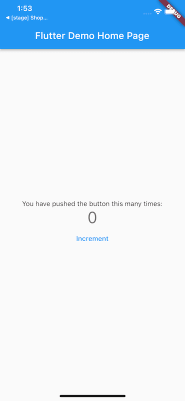
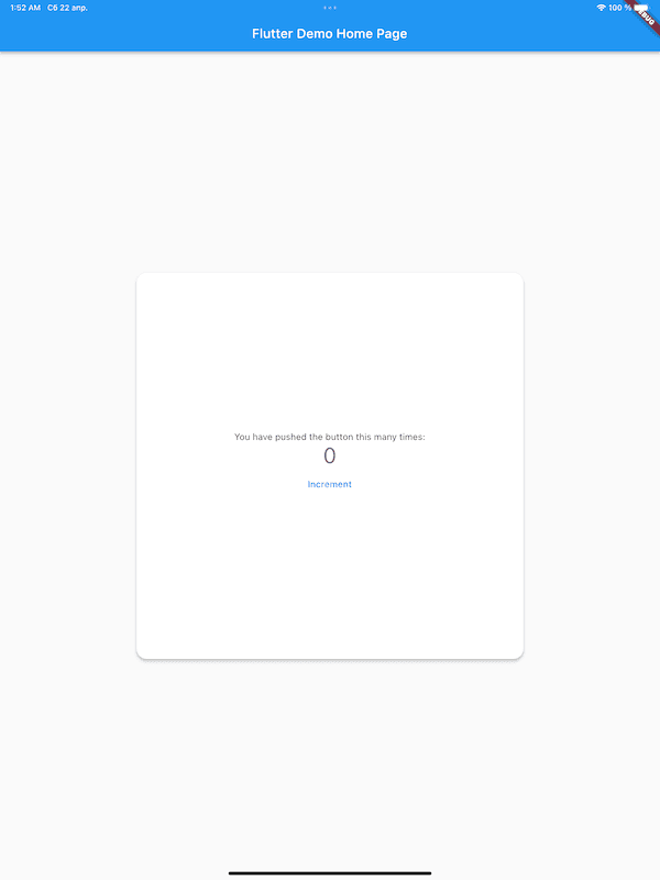
AdaptiveLayout takes one builder per screen size and a child. It measures the device through MediaQuery, maps that to a ScreenSize, and builds only the matching variant — with the child created once and handed to whichever builder wins.
AdaptiveLayout(
  smallBuilder: (context, child) => child!,
  mediumBuilder: (context, child) => Center(child: child),
  largeBuilder: (context, child) => Row(
    children: [const Sidebar(), Expanded(child: child!)],
  ),
  child: const MyHomePage(),
)
The responsive decision now lives in one widget, at the top of the subtree it governs, written as three layouts rather than a chain of conditions.
What It Supports
- Screen-size-driven layouts —
smallBuilder,mediumBuilder, andlargeBuilder, each optional; a missing one falls back tochild, so you can style only the sizes you care about - Breakpoints you control — defaults of 400 and 600 logical pixels, overridable per widget or for the whole app
- Build the child once — switching layouts wraps your content instead of rebuilding it from scratch
- Rotation stability — classification reads
MediaQuery.of(context).size.shortestSide, so a phone stays small in landscape - Pluggable sizing logic — implement
ScreenSizeQualifierto classify by width, platform, hinge state, or whatever your design system uses - No dependencies — pure Flutter on top of
MediaQuery, working on iOS, Android, web, macOS, Windows, and Linux
How Screen Size Is Decided
The default BreakpointsQualifier compares the shortest side against two breakpoints, inclusively — a value exactly equal to a breakpoint belongs to the smaller bucket.
| Screen size | Condition | Default range | Typical device |
|---|---|---|---|
ScreenSize.small | shortestSide <= smallBreakpoint | 0–400 logical pixels | Phones |
ScreenSize.medium | shortestSide <= mediumBreakpoint | 401–600 logical pixels | Small tablets |
ScreenSize.large | above mediumBreakpoint | 601+ logical pixels | Large tablets, desktop |
Breakpoints resolve in a fixed order, first defined value winning: the arguments passed to BreakpointsQualifier, then the nearest ancestor BreakpointsSetting, then the built-in 400 and 600.
Real-World Use Cases
Phone-first apps growing a tablet build
An app that started on phones can keep every screen it already has and add a largeBuilder where a wider layout pays off. Screens with no builder for a size render the child unchanged, so the migration happens screen by screen instead of all at once.
Master–detail navigation
A list that pushes a detail route on a phone can render list and detail side by side on a tablet. The two variants are declared next to each other in one widget, which makes the difference between them reviewable in a diff.
Design systems with their own breakpoints
Wrap MaterialApp in BreakpointsSetting once and every AdaptiveLayout in the tree picks up the design system's numbers. Changing them later is a one-line edit, not a search across the codebase.
Web and desktop windows
On web and desktop the measured size is the window, so layouts respond as the user resizes it — the same code path that handles a tablet handles a resized browser.
Getting Started
Install the package:
flutter pub add flutter_adaptive_layout
Requires Dart >=2.18.5 <4.0.0 and Flutter 1.17+.
Then import it and wrap the widget whose layout should adapt:
import 'package:flutter_adaptive_layout/flutter_adaptive_layout.dart';

AdaptiveLayout(
  largeBuilder: (context, child) => Center(
    child: SizedBox(width: 600, child: child),
  ),
  child: const ArticleView(), // used as-is on small and medium screens
)
To classify screens differently, implement ScreenSizeQualifier and pass it as qualifier:
class WidthQualifier extends ScreenSizeQualifier {
  @override
  ScreenSize qualify(BuildContext context) {
    final width = MediaQuery.of(context).size.width;
    if (width < 600) return ScreenSize.small;
    if (width < 1024) return ScreenSize.medium;
    return ScreenSize.large;
  }
}
qualify runs on every build, so keep it cheap and free of side effects.
A complete, runnable app is in the example directory.
